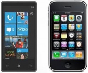
Phones, Tablets, and the Future
I’ve been thinking a lot about technology, recently.
More specifically, my friend Eli Juicy Jones (Eli’s Blog) and I have been talking and thinking about the future of mobile devices.
Not too long ago, I was tapping a Facebook message into my iphone when I realized that it had been three days since I had last used my desktop computer. I was surprised by how capable my little digital Swiss Army Knife had become, despite (or perhaps, because of?) having seen its feature set grow through software updates and third party apps.
(It was around this time that I hypothesized to Eli that Apple would introduce an App Store for desktop computing, and that this would be the first step in a convergence of Apple’s iOS and Mac OS X. The results of my long term prognostication obviously remain to be seen, but it is worth mentioning that the App Store now has a quiet, unassuming place on my MacBook’s Application Dock.)
It seems from their dominance that our interfaces for our smart phones are solved. Even Android- a platform somewhat infamous for it’s lackluster polish and unifying design vision- has been making incredible strides in usability. With the advent of large scale tablet devices (like Apple’s iPad and Samsung’s Galaxy Tab) one would think that we could simply port over the lessons we learned on phones and have excellent devices, ready to deliver us the trinkets of our Digital Lifestyle right out of the gate. Apple and Samsung both seem to have taken this idea to heart, as using either device has the distinct feeling of using a blown up iOS or Android phone.
Which, I suppose, is fine. Logic would dictate that one could then get at /least/ as much utility out of an iPad as out of an iPhone, and we’ve already shown that that’s good enough to make even desktops look clunky. But is an interface designed for small, data-dense screens really suitable for something larger? It’s obvious when one uses an app designed with the big screen in mind; it’s beautiful, simple, elegant, and intuitive. Shouldn’t it all be like that? Shouldn’t things be /better/ than on our phones?
Part of the issue is that we didn’t exactly build our interfaces to scale. Moving little square buttons around a grid is fine when you’re on a small screen with a few apps, but it becomes unmanageable as space increases. What if someone figured out how to make an interface that could clearly scale? What if someone just had to make an app once, and it would fit on everything from phone to tablet to TV? The hardware is here to make our electronic lives genuinely comfortable. Why hasn’t the software caught up?
Fortunately, there are people working on it. The new Windows Phone 7 interface is magical, and it is my hope that it is shamelessly ripped off by every other manufacturer. Its “Metro” GUI, which begins with the radical assumption that a program’s interface can exist outside the viewable bounds of the screen, does such a wonderful job exposing information to the user that it seems like clicking is barely required. Buttons expand to fill areas, using their newfound surface area to display information quickly and subtly. Often, opening an app isn’t even required, as everything you need to know just flips into place on it’s button, like a mini-airport arrival board. Inside apps, functionality is segmented in tabs whose size is irrelevant. The screen slides about like a viewfinder over a larger interface, an effect that makes it seem like WP7 is destined for tablets. In fact, the basic features of it’s design have already proven themselves on large format screens, in the form of the current Xbox 360 dashboard. It might be the future, and odds are you’ve already used it.
One day, tablet devices will be ready to be the dominant form or computing for most users. Unfortunately, we aren’t quite there yet, though we should have high hopes for the second generation of the technology.
Our awesome smart phones will keep us company in the meantime. 🙂

That’s a very excellent observation. Google’s Andy Rubin said something very similar when he showed off the next Android incarnation on their “flagship” tablet device –
http://www.androidguys.com/2010/12/07/video-google-maps-5-motorola-tablet-dive-mobile-video/
He talks about giving tools to developers to instruct the app how to handle “panels” of information on the many different-sized devices. He shows how Gmail on a tablet/TV has two panels, a list and a reading panel, while the same app would just have one panel that slides back and forth as needed.